

News
KUBS News
KUBS Unveils New Shield Logo … Reflecting KUBS Vision and Identity
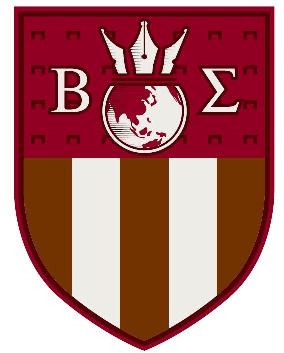
Korea University Business School (KUBS) unveils its new shield logo. The shield features a globe, which resembles KUBS stepping up to the world stage, and the tip of a pen indicating academic exploration. Beta (Β) and Sigma (Σ) represent “BS,” an abbreviation of Business School. The Latin alphabets were used to express the ideology of studies. Previously, KUBS shared the same logo of Korea University; however, as the business school uses its unique shield, KUBS can now express its vision and identity.
The new logo has a shield shape — just like the logo of Korea University. The shield connotes Yong Ik Lee’s belief “National Salvation through Education.” As KUBS falls under the Division of Humanities and Social Sciences, the shield is "party per fess," which is halved horizontally. Crimson, the signature color for Korea University, is mainly used, and KUBS’s primary color, dark brown with straight lines is used on the bottom. These straight lines indicate the KUBS buildings, emphasizing the university’s identity while the overall balance and density of the shield logo were considered.
KUBS will gradually apply the new shield logo in many communication channels, such as the website, brochures, and other internal and external materials.
In the meantime, as part of celebrating its 111th anniversary, Korea University collected special features of each college and distributed the new symbols to the 21 colleges last year. The symbols contain each college’s pride and dignity. Although all colleges use the same shield shape, the shield of each academic field is divided as follows: The Division of Humanities and Social Sciences and the Division of Natural Sciences and Engineering are parted in horizontal and vertical lines, respectively. The Division of Arts and Music is parted diagonally from upper right to lower left.